
I'd just like to call your attention to some of the interesting posts being made by some of your fellow students.
Shinmegami no tsuki
Offers a really nice technique for getting that strange, subtly evil look (a la Grudge, or The Ring) out of a normal photograph. From what I can tell, the more "amateurish" the photograph is to begin with, the better.
Nguyen Ai Nhi
Takes a look at semiotics the Honda logo and why it works for the bike company.
Won-Gi
Takes a look at the brain as a user interface, and also gives us a critique on a piece of own work - an ad for boxing equipment... Do the combination of images mean the same thing to you? Go take a look and leave your opinion of what you think the collage means!
K. Mai
Found a tutorial that is a nice colour blending exercise - and gives nice subtle realistic colour.
8ctopuS
Has given a very good explanation about the "golden ratio" - a mathematical formula that attempted to quantify what "beauty" was and how to reproduce it.
Cat ^-^
Takes a look at the Sony Vaio logo and deconstructs it simply and effectively.
Boong
Has created a set of stylish flowing icons for the imaginary photographer client. Go and see if you think the meaning of each icon would survive if the words were not there.
Ruby Wind
Offers us a look at Adine Kinberg - a rather elegant script font. What kind of applications do you think might be good for a font of this kind?
Dark Moon
Has found a really nice blog template - and has also spent some time looking at the Prudential Logo. Do you agree on what makes it an effective symbol for an insurance company? Do you think that, perhaps, the cultural associations (A greek God) might be good or bad for an Asian market?
Malobolobala
Shows a design for a Dance Club flier? What strategies might be used for informing a viewer that certain bits of information might be more important than others? How do you cope with having to show a lot of information without overwhelming your audience?
Also, the goodbye card - here's a link to a neat way to make it snow, in flash. Kirupa.com does it with action script and provides an easy to follow tutorial. Not only is the snow random, but it's darker and lighter depending on distance. Finally, you can change the direction of the wind by moving your mouse!!!!
Kirupa.com
Lili
Has taken a single fancy script type letter and turned it into a logo. What kind of clients might suit this kind of formal, elegant logo? What kind of products might be sold well using this elegant approach.
Showing posts with label Flash. Show all posts
Showing posts with label Flash. Show all posts
Wednesday, July 4, 2007
Wednesday, June 27, 2007
Creating a Seamless and Endless Moving Background in Flash
Very often, you want to create a flash that looks like something or someone is moving, walking, or driving against a background that changes (like a dolly shot in a film). In flash this is done by providing a wide, short background that loops - but it's hard to get it to look perfect.
This tutorial which uses a little bit of easy actionscript creates a PERFECT scrolling background. This effect can be used for other things too - like the changing background of a short film, or an abstract piece.
http://www.pixelhivedesign.com/tutorials/Endless+Scrolling+Background/
This tutorial which uses a little bit of easy actionscript creates a PERFECT scrolling background. This effect can be used for other things too - like the changing background of a short film, or an abstract piece.
http://www.pixelhivedesign.com/tutorials/Endless+Scrolling+Background/
Zoom & Blur Effects in Flash
When a camera zooms in on a scene, very often for a few moments, the image, as the zoom is happening, is not crisp, especially if the zoom is a very fast one.
Here is a nice easy tutorial for how to achieve this realistic filmic effect in flash.
http://www.flashfridge.com/tutorial.asp?ID=37
Here is a nice easy tutorial for how to achieve this realistic filmic effect in flash.
http://www.flashfridge.com/tutorial.asp?ID=37
Tuesday, April 3, 2007
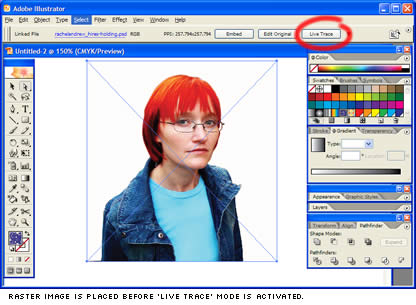
Turning a Bitmap image into Vector for flash
 Sitepoint offers an excellent tutorial for turning a bitmap image into a vector file that is scaleable and importable into flash.
The steps are easy to understand, and it gives you a very good overview of how to reduce vector points to keep the file small while giving you a stylish, edgy look to the photograph.
Have a go at it HERE
Subscribe to:
Comments (Atom)
